After my last post, one of my occasional posts on something not state related, I decided to go back to my old tricks: the American states, demographics, and the 2008 election.
The election if fascinating for me because it allows an operationalization of attitudes that it is hard to capture with other statistics. Vermont and Idaho are very different, but what exactly the difference is, is hard to describe until you have an election, and then you have a gigantic difference between the two, that can be plotted. Or, for that matter, Montana and Idaho are very different, but it is hard to say so until you have an election. I mean, besides its obvious that Montana is better than Idaho.
The two variables I looked at today, poverty rate and Obama's margin, show again something that I have been harping on: the different states and areas of the United States have different demographics. This was especially obscured during the evil era of 2004-2005, and "red state/blue state". Despite some similarities in electoral patterns, there is not a lot else that Wyoming and West Virginia have in common. To wit:

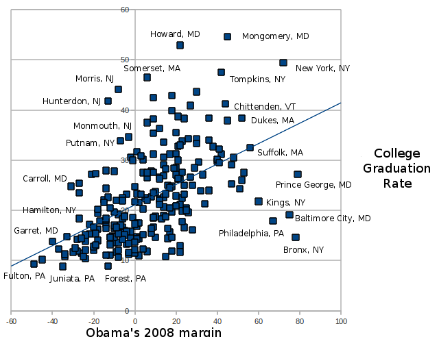
What is interesting about this diagram (and I thought it was so interesting that I put it a larger size, and labeled every single state, because there is a lot going on here), is that there is some pretty clear geographic grouping. Especially over on the left side of the diagram, we have two different groups of states that supported McCain: a low-poverty group, consisting of mountain and prairie states, and a high-poverty
group that consisted of southern and Appalachian states. Also, notice that almost all the mountain and prairie states are relatively McCain-supporting, (which depends on whether Nevada and New Mexico are considered mountain states) and relatively low in poverty. Likewise, all southern/Appalachian states are high in poverty, and all support McCain. There is also no middle ground: there are (almost) no states with a poverty rate close to the US average that were strongly McCain-supporting. (The exception to this is possibly Idaho).
Another interesting thing about this diagram is none of the states that were close states (defined currently as within a 5 point margin either way) had a very high or very low poverty rate. What is even more interesting about these states is that they otherwise don't have much in common: Montana, Georgia, North Carolina, Ohio, Florida, Missouri and Indiana don't have much in common, besides all being close to the US median poverty rate, and being right on the fence in the election. Arizona was also probably in this group, but broke a little bit more for McCain than its "true" politics would suggest, because it was his homestate. I think these eight states will continue to be 'in the middle'.
There is also a gap between the Florida/Ohio line and states down and to the right. My intuition is that states like Virginia and Colorado, which are to the right of that gap, are where the true Democratic electoral base begins. Although Virginia and Colorado were seen as "swing" states this election, I believe they were actually states that shifted into the base. They have high levels of education, and low levels of poverty, and I think that they are closer to the base than Florida and Ohio are.
Another point to make, especially in regards to me grouping together the prairie/mountain states, is the difference between those states and, say, Colorado, Oregon and Washington might be less than you would expect either from stereotypes or from this chart. From what I have looked at before, the patterns in, say, Wyoming and Oregon are the same. Counties with large amounts of college educated people still go Democratic, sometimes dramatically so. The difference is, Oregon has a lot of those counties, and Wyoming has two of them, and those two counties have fewer people. The pattern in mountain/prairie states is to have the major Democratic-leaning group to be college educated and urban people. In the Appalachian/South, the major Democratic-leaning group seems to be African-Americans. The two sides of the Republican-coalition are also moving in opposite directions: South/Appalachia is becoming more conservative (although partially this is just a result of not having a Clinton and a Gore on the ticket), which the mountain/prairie seems to be becoming more liberal.
My own feeling is, if 2008 is the
underlying picture, the Democrats have a really strong position. Greater education and urbanization seem to be moving some areas permanently into their column, such as Colorado and Virginia. It could be that Obama's success in 2008 was a reaction against Bush, and 2004 is closer to the
underlying electoral picture. My own belief is that for some of the states, 2008 was the real picture, and for others it was a reaction. And this diagram actually, to me, gives a pretty good idea of which states are which. Ohio and Florida were reaction, Colorado and Virginia were demographic shift.
Of course, there are many other things that can come up. Will Hispanics remain a Democratic group? Will young and college educated people remain Democratic? Will the low-poverty, high education mountain/prairie states continue to become (at least slightly) more Democratic, and the high-poverty, low education Southern/Appalachian states become more Republican? Will incumbency be an advantage, or a disadvantage?
We don't know the future. We can only plot the past.
 This shows much the same trend as the last chart: in 1994, the Republican Party got a slight advantage in the vote, probably due to a demographic shift with union voters and southern voters, which then reversed in 2006 and 2008, which could have been either a demographic shift, or an event-driven shift.
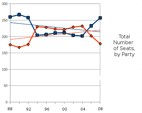
 p some of the conventional wisdom: