Wednesday, August 25, 2010

The house history, Part II

Last post, we looked at the total number of house seats that both parties have held since 1988. This post, we look at what percentage each party got.

If parties got votes, which they EMPHATICALLY do not, as I have tried to patiently explain to a very smart British scholar who seems to miss the point of American politics.
But lets pretend for a minute that they do. This is what percentage of the votes candidates for both parties have gotten since 1988:
This shows much the same trend as the last chart: in 1994, the Republican Party got a slight advantage in the vote, probably due to a demographic shift with union voters and southern voters, which then reversed in 2006 and 2008, which could have been either a demographic shift, or an event-driven shift.
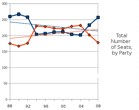
What it shows that is even more significant is how tenuous both party's hold on the house is, percentage wise. Most significantly, the 1994 "Republican Revolution" was not caused by an upswing in the Republican's percentage, but a downswing in the Democratic percentage. In 1994, the Republicans got 47.8% of the vote, hardly a "revolution". In fact, in this graph, there is only one year in which the Republican Party got more than 50% of the house vote, and that was 2004. Not that the Democratic Party has done much better, although the last two elections have had pretty good numbers.

There is a number of things that can happen this November, but based on this graph, I am going to guess that neither party will have much of an advantage in percentage, or in seats. A lot depends on whether the last two elections were about changing demographics, or about swing voters reacting to events.

In any case, my own guess based on both of these graphs, is that the election will go something like 50.1% to 49.9% (although, of course, numbers won't add to 100), with either party capturing the high number. Also, the party with the higher percentage might not win the house. Whichever party does win the house will win by a small margin of seats, probably around 5 seats.

And, the national media being what it is, the week after the election, whoever wins will be spun as a new NARRATIVE. If the Republicans manage to get 100,000 extra voters and 5 extra seats, it will be a NARRATIVE that the mainstream of the United States has refudiated BIG GOVERNMENT. If the Democratic party manages to swing those 100,000 votes and hold on to a 5 point advantage, the NARRATIVE will be that the mainstream of the United States has refudiated TEA PARTY EXTREMISTS. In either case, no such thing will have happened, and a new narrative will be found.

Saturday, August 21, 2010

Back with a brief update

First, I am going to get around to deleting spam comments.

Second, I will be posting more data. At some point. I have had other things on my mind.
But! Here is something to tide you over.
As we look towards the 2010 house elections, there are two major trends: first, the demographic trend starting in the late 1980s, where the union voters in the midwest and the traditionally Democratic voters in the south switched to the Republican party. Second, there is the event driven growth of the Democratic Party in 2006 and 2008. The last two elections could also be demographic, as urban and educated voters switch to the Democratic Party.

So which is the "true" trendline? Ask me in a little under three months!

Saturday, June 26, 2010

I haven't forgotten.

I haven't forgotten this blog.

There will be more.

Maybe even soon.

Tuesday, May 4, 2010

And since I have already left the path: a bar graph

Once I have freed myself from the tyranny of confining myself to scatter plots, interesting questions have raised themselves. This one is demonstrated by a bar graph.
One of my conclusions about the "Core Electoral Votes" was that they showed that the election was indeed becoming more polarized. After thinking of ways to express this, I decided to make bar graphs showing the number of electoral votes that Obama scored a certain percentage of the popular vote in (This sentence does make sense). I then tried to find another electoral winner who had a similar-sized victory, and tried to break down their electoral votes down similarly. Although it is far from a good comparison, the best comparison to Obama's '08 victory was probably the first Bush, in '88. (2 candidates, similar numbers in popular and electoral votes).p some of the conventional wisdom:
This diagram confirms some conventional wisdom: elections are indeed becoming more polarized, at least as far as different regions of the country having different values. Bush in 1988 got more electoral votes than Obama did in 2008, but a great of them were in a narrow band between 50% and 55%. On either side of that, he fell off, getting below 45% in only a handful of states, and also getting over 60% in only a few states. The bar graphs form a triangle, of sorts. Obama, on the other hand, scored all over. His largest category for electoral votes was actually over 60%, and there are three separate peaks with two separate valleys. Even given his good popular vote and large electoral vote margins, there were areas that didn't move at all. The middle ground, between 45-55%, is much smaller than sense says it should be.

I think this does speak of polarization: in 1988, Massachusetts and Oklahoma might have different results, but the results would move together. Now, that is not the case.

Monday, May 3, 2010

Since I seem to have abandoned the "daily" thing, lets abandon the scatter plots as well.

So, I slowed down updating this, and haven't updated this in two weeks.

This is mostly because I feel I have exhausted a lot of what I wanted to talk about. Actually, I should at some point summarize what I have learned, but I don't have a lot more to say about most of what I was covering.

But, I did, on a lark, think of a question that can be used with another type of graph. And so, I present a non-scatterplot to you.

In the US election system, the president is chosen by electoral votes. The electoral system can greatly magnify a candidates success or failure. Also, electoral votes can be won by plurality, meaning a candidate can win the presidency in a landslide without actually winning any of the states by a majority. Clinton did this in 1992, only winning 9 electoral votes (Arkansas and DC) by majority, but getting 370 Electoral Votes.

So I decided to look at the history of how many Electoral Votes were won by over 60% of the vote. These show states that were won with what could be seen as a strong consensus. So from 1960 until 2008, here is the fate of both party's ability to truly capture states:
Much as with my scatterplots, the first lesson to be learned from this graph is unpredictability. The biggest lesson seems to be that holding on to Core Electoral Votes is very difficult. Even after the biggest landslides ('64, '72 and '84), the amount of core electoral votes drops. This also leads some credence to the belief that elections are more about candidates and circumstances than they are about the deep seated philosophical leanings of the electorate. Was Reagan's victory in 1984 a sign of a deep seated conservative bent in the US? According to this diagram, it would seem not, because just 4 years later, the amount of states showing a really strong commitment to support the Republican candidate shrunk down to just a few in strongholds. Of course, the same could be said of the movement from 1964 to 1968.

Another trend that actually shows up from popular political discourse in this is that some of the "Red State/Blue State" and "polarization" seems to have some evidence for it. In previous elections, one party might get a lot of Core Electoral Votes, or both parties might get none or close to none... but only since 2000 have both parties managed to have strongholds. So there is some truth to it: the current political situation is one where, regardless of candidate, Massachusetts will probably go over 60% for the Democrat, and Oklahoma will go over 60% for the Republican.

Of course, since the unexpected is expected, I bet 2012 will have some interesting changes to make to this chart.

Saturday, April 17, 2010

Education and the election by region: The Northeast

And we come to what would be our final region, the Northeast, or what would be our final region besides it seems that I didn't actually include the West when I posted earlier.
But the Northeast, (Maine, New Hampshire, Massachusetts, Vermont, Connecticut, Rhode Island, New York, New Jersey, Pennsylvania, Delaware and Maryland) even though it is declining in importance, is still one of the most important regions in the country, both electorally and otherwise. It has 114 electoral votes, and has a large manufacturing base, and some of the countries largest and most ethnically diverse cities. It is home to much of the country's educated elite, and is also very strongly and consistently Democratic. Other than a curveball plurality decision in New Hampshire, every state in this region has voted Democratic since 1992.
This area does have some conservative counties, but they are mostly in the rural areas of Appalachia. There is a smattering of educated counties that McCain carried, and most of them are in suburban New Jersey. Other than that, all of the counties over the 30% mark voted for Obama. However, there is a pretty good chance that a lot of this is due to race: as we can see from the lower right of this diagram, this area's ethnically diverse population was probably just as important to Obama's success as its college-educated population. The fact that there is a conservative middle class in New Jersey is a small chink in the armor of Democratic dominance in this region.

Thursday, April 15, 2010

Education and the election by region: The Midwest

The next region presented is the rolling heartland of America, the Midwest, which (for my purposes) consists of Minnesota, Wisconsin, Iowa, Missouri, Illinois, Indiana, Michigan and Ohio. This region is very diverse, having both some very large metropolises, and many rural areas. It has a manufacturing base and an agricultural base. This area also gave 85 of its 96 electoral votes to Obama, with losing Missouri by a few thousand votes.
As with many areas, we have a large bulk of counties in the lower left, mostly small, rural counties. There is also some counties extending out to the lower right, but not extending too far. In this region, there was many rural, white, low education counties that Obama won, although he won them by smaller margins. He won by 60-40 in rural Wisconsin and lost by 40-60 in rural Missouri. Other than that, the pattern seems to be to be tied between the 20 and 30 mark, and then for education to become a pretty strong factor in favor of Obama above the 30% mark, although there are a few wealthy suburban counties that voted for McCain.