Wednesday, August 25, 2010

The house history, Part II

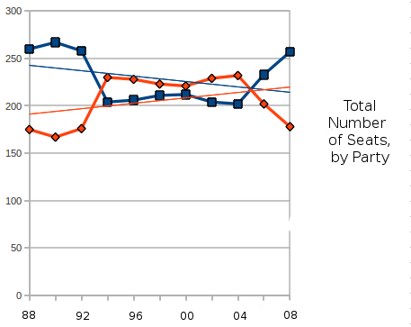
Last post, we looked at the total number of house seats that both parties have held since 1988. This post, we look at what percentage each party got.

If parties got votes, which they EMPHATICALLY do not, as I have tried to patiently explain to a very smart British scholar who seems to miss the point of American politics.
But lets pretend for a minute that they do. This is what percentage of the votes candidates for both parties have gotten since 1988:
This shows much the same trend as the last chart: in 1994, the Republican Party got a slight advantage in the vote, probably due to a demographic shift with union voters and southern voters, which then reversed in 2006 and 2008, which could have been either a demographic shift, or an event-driven shift.
What it shows that is even more significant is how tenuous both party's hold on the house is, percentage wise. Most significantly, the 1994 "Republican Revolution" was not caused by an upswing in the Republican's percentage, but a downswing in the Democratic percentage. In 1994, the Republicans got 47.8% of the vote, hardly a "revolution". In fact, in this graph, there is only one year in which the Republican Party got more than 50% of the house vote, and that was 2004. Not that the Democratic Party has done much better, although the last two elections have had pretty good numbers.

There is a number of things that can happen this November, but based on this graph, I am going to guess that neither party will have much of an advantage in percentage, or in seats. A lot depends on whether the last two elections were about changing demographics, or about swing voters reacting to events.

In any case, my own guess based on both of these graphs, is that the election will go something like 50.1% to 49.9% (although, of course, numbers won't add to 100), with either party capturing the high number. Also, the party with the higher percentage might not win the house. Whichever party does win the house will win by a small margin of seats, probably around 5 seats.

And, the national media being what it is, the week after the election, whoever wins will be spun as a new NARRATIVE. If the Republicans manage to get 100,000 extra voters and 5 extra seats, it will be a NARRATIVE that the mainstream of the United States has refudiated BIG GOVERNMENT. If the Democratic party manages to swing those 100,000 votes and hold on to a 5 point advantage, the NARRATIVE will be that the mainstream of the United States has refudiated TEA PARTY EXTREMISTS. In either case, no such thing will have happened, and a new narrative will be found.

Saturday, August 21, 2010

Back with a brief update

First, I am going to get around to deleting spam comments.

Second, I will be posting more data. At some point. I have had other things on my mind.
But! Here is something to tide you over.
As we look towards the 2010 house elections, there are two major trends: first, the demographic trend starting in the late 1980s, where the union voters in the midwest and the traditionally Democratic voters in the south switched to the Republican party. Second, there is the event driven growth of the Democratic Party in 2006 and 2008. The last two elections could also be demographic, as urban and educated voters switch to the Democratic Party.

So which is the "true" trendline? Ask me in a little under three months!

Saturday, June 26, 2010

I haven't forgotten.

I haven't forgotten this blog.

There will be more.

Maybe even soon.

Tuesday, May 4, 2010

And since I have already left the path: a bar graph

Once I have freed myself from the tyranny of confining myself to scatter plots, interesting questions have raised themselves. This one is demonstrated by a bar graph.
One of my conclusions about the "Core Electoral Votes" was that they showed that the election was indeed becoming more polarized. After thinking of ways to express this, I decided to make bar graphs showing the number of electoral votes that Obama scored a certain percentage of the popular vote in (This sentence does make sense). I then tried to find another electoral winner who had a similar-sized victory, and tried to break down their electoral votes down similarly. Although it is far from a good comparison, the best comparison to Obama's '08 victory was probably the first Bush, in '88. (2 candidates, similar numbers in popular and electoral votes).p some of the conventional wisdom:
This diagram confirms some conventional wisdom: elections are indeed becoming more polarized, at least as far as different regions of the country having different values. Bush in 1988 got more electoral votes than Obama did in 2008, but a great of them were in a narrow band between 50% and 55%. On either side of that, he fell off, getting below 45% in only a handful of states, and also getting over 60% in only a few states. The bar graphs form a triangle, of sorts. Obama, on the other hand, scored all over. His largest category for electoral votes was actually over 60%, and there are three separate peaks with two separate valleys. Even given his good popular vote and large electoral vote margins, there were areas that didn't move at all. The middle ground, between 45-55%, is much smaller than sense says it should be.

I think this does speak of polarization: in 1988, Massachusetts and Oklahoma might have different results, but the results would move together. Now, that is not the case.

Monday, May 3, 2010

Since I seem to have abandoned the "daily" thing, lets abandon the scatter plots as well.

So, I slowed down updating this, and haven't updated this in two weeks.

This is mostly because I feel I have exhausted a lot of what I wanted to talk about. Actually, I should at some point summarize what I have learned, but I don't have a lot more to say about most of what I was covering.

But, I did, on a lark, think of a question that can be used with another type of graph. And so, I present a non-scatterplot to you.

In the US election system, the president is chosen by electoral votes. The electoral system can greatly magnify a candidates success or failure. Also, electoral votes can be won by plurality, meaning a candidate can win the presidency in a landslide without actually winning any of the states by a majority. Clinton did this in 1992, only winning 9 electoral votes (Arkansas and DC) by majority, but getting 370 Electoral Votes.

So I decided to look at the history of how many Electoral Votes were won by over 60% of the vote. These show states that were won with what could be seen as a strong consensus. So from 1960 until 2008, here is the fate of both party's ability to truly capture states:
Much as with my scatterplots, the first lesson to be learned from this graph is unpredictability. The biggest lesson seems to be that holding on to Core Electoral Votes is very difficult. Even after the biggest landslides ('64, '72 and '84), the amount of core electoral votes drops. This also leads some credence to the belief that elections are more about candidates and circumstances than they are about the deep seated philosophical leanings of the electorate. Was Reagan's victory in 1984 a sign of a deep seated conservative bent in the US? According to this diagram, it would seem not, because just 4 years later, the amount of states showing a really strong commitment to support the Republican candidate shrunk down to just a few in strongholds. Of course, the same could be said of the movement from 1964 to 1968.

Another trend that actually shows up from popular political discourse in this is that some of the "Red State/Blue State" and "polarization" seems to have some evidence for it. In previous elections, one party might get a lot of Core Electoral Votes, or both parties might get none or close to none... but only since 2000 have both parties managed to have strongholds. So there is some truth to it: the current political situation is one where, regardless of candidate, Massachusetts will probably go over 60% for the Democrat, and Oklahoma will go over 60% for the Republican.

Of course, since the unexpected is expected, I bet 2012 will have some interesting changes to make to this chart.

Saturday, April 17, 2010

Education and the election by region: The Northeast

And we come to what would be our final region, the Northeast, or what would be our final region besides it seems that I didn't actually include the West when I posted earlier.
But the Northeast, (Maine, New Hampshire, Massachusetts, Vermont, Connecticut, Rhode Island, New York, New Jersey, Pennsylvania, Delaware and Maryland) even though it is declining in importance, is still one of the most important regions in the country, both electorally and otherwise. It has 114 electoral votes, and has a large manufacturing base, and some of the countries largest and most ethnically diverse cities. It is home to much of the country's educated elite, and is also very strongly and consistently Democratic. Other than a curveball plurality decision in New Hampshire, every state in this region has voted Democratic since 1992.
This area does have some conservative counties, but they are mostly in the rural areas of Appalachia. There is a smattering of educated counties that McCain carried, and most of them are in suburban New Jersey. Other than that, all of the counties over the 30% mark voted for Obama. However, there is a pretty good chance that a lot of this is due to race: as we can see from the lower right of this diagram, this area's ethnically diverse population was probably just as important to Obama's success as its college-educated population. The fact that there is a conservative middle class in New Jersey is a small chink in the armor of Democratic dominance in this region.

Thursday, April 15, 2010

Education and the election by region: The Midwest

The next region presented is the rolling heartland of America, the Midwest, which (for my purposes) consists of Minnesota, Wisconsin, Iowa, Missouri, Illinois, Indiana, Michigan and Ohio. This region is very diverse, having both some very large metropolises, and many rural areas. It has a manufacturing base and an agricultural base. This area also gave 85 of its 96 electoral votes to Obama, with losing Missouri by a few thousand votes.
As with many areas, we have a large bulk of counties in the lower left, mostly small, rural counties. There is also some counties extending out to the lower right, but not extending too far. In this region, there was many rural, white, low education counties that Obama won, although he won them by smaller margins. He won by 60-40 in rural Wisconsin and lost by 40-60 in rural Missouri. Other than that, the pattern seems to be to be tied between the 20 and 30 mark, and then for education to become a pretty strong factor in favor of Obama above the 30% mark, although there are a few wealthy suburban counties that voted for McCain.

Wednesday, April 14, 2010

Education and the election by region: Coastal South

Our next region is the Coastal South, which compromises Virginia, North Carolina, South Carolina, Georgia, and Florida. Once again, this is a somewhat artificial region, since I believe South Carolina and Georgia might have more in common with Alabama and Mississippi than they do with the metropolitan states of the coast. However, that is a running caveat, and since this entire thing has gone on for quite a while, lets look at what we have:
This area does have some high education counties, and actually quite a few of them, but they seem to be mostly located in Virginia (NoVA, to be precise), with a few in North Carolina. The high education suburbs that voted strongly for McCain are mostly in Georgia. Although Florida is included here, none of its counties are strong outliers, which may be significant. There is also not quite as many heavily minority, low-education counties as there were in the interior South.

Monday, April 12, 2010

Education and the election by region: Interior South

Due to a string of computer problems, I haven't been able to update people fully on the wonders of demographics and politics. But now I am able to do so, and I am going to move to the next region, the Interior South. I originally just did "The South", but that was too large of a region, so I decided to break it down into the Interior South and the Coastal South. The Interior South consists of Arkansas, Louisiana, Mississippi, Alabama, Tennessee, Kentucky and West Virginia. As always, this is a somewhat artificial group of states, but I think it makes sense in some ways.That being said, lets see what we have:
There are probably three major stereotypes that apply here: that compared to other regions, the Interior South is less educated, more conservative, and the vote is split more along racial lines than in any other region. And this plot shows that that is indeed the case.
There are only 11 counties with over 30% college graduates, and those counties voted for McCain over Obama 7-5. The most educated county in this region voted for McCain, and that seems to also be unique. Also, while the less-educated counties the Great Plains and western regions hovered around the 15% mark, here they seem to be clumped around the 10% mark.
Even the counties that did vote for Obama that have higher education rates seem to be the most African-American, and so the education here is mostly an artifact.
So:
In the interior south, race and not education is probably the defining mark of the electorate.

Saturday, April 3, 2010

Education and the election by region: Texas

After having done the great plains, I reach my 4th region: Texas.
Yes, Texas gets to be a region all by itself. Popular belief (especially amongst Texans) would have it that Texas is unique amongst the states, and it is not an unfounded belief. Because Texas has some very urban areas, some very rural areas, some very Hispanic areas, and has aspects of being both a Southern, a Great Plains, and a Western state, as well as the fact that it has lots and lots of counties, I decided to put it in a category of its own.
Texas has some of the patterns we know and (love), but has some patterns of its own. We have a lot of counties in the lower right that are strongly minority (most of which are Hispanic, but I think some African-American counties along the TX/LA border might be there too). We have a lot of rural, white, conservative counties in the lower left. We have some conservative suburban counties in the upper left. And we have our single "college town" county, Travis (home of Austin and the University of Texas) in the upper right.
One thing that is interesting is that while the conservative suburban counties in the upper left are slightly less conservative than the conservative rural counties in the lower left, they are still, compared to many other areas of the country, pretty conservative. In California, Orange County slipped through with a 2 point margin for McCain. Here, we have many counties over the 30 mark with big margins.
Second thing to notice: notice how close Dallas (Dallas), Bexar (San Antonio) and Harris (Houston) are to each other. These aren't the best educated counties in Texas, but they are three of the biggest. So it looks like the big urban areas are moving to the Democratic column, but I suspect that has to do with minority population: their better educated suburbs are still more conservative than them. Tarrant and Hays, which are both suburban counties, with good college rates, seem to be following the liberal pattern, though.
Also, notice in the bottom, there is a big hole in the middle. Low education counties in Texas are strongly conservative (if they are White) or strongly liberal (if they are Hispanic), but none of them seem to be contested.
I think the bottom line in Texas is that while the Black and Hispanic vote make it somewhat competitive, a state where the well-educated suburbs are still strongly conservative is fated to be conservative for a while longer.

Thursday, April 1, 2010

Education and the elections by region: The Great Plains

Since I have already done the mountain/Pacific Northwest states previously, I am skipping to the next region: the Great Plains. The Great Plains, which constitutes North Dakota, South Dakota, Nebraska, Kansas and Oklahoma, is the smallest region in terms of population that I will be looking at. But I feel that it is indeed a unique region, because unlike the Western States, which tend to have geographically larger counties, the counties in this area tend to be smaller, and have no barriers between them. Thus, there are much fewer places where counties have distinctive demographies. This is also the case in the Midwest, but unlike in the Midwest, the Great Plains has fewer enclaves that are either ethnically diverse or home to manufacturing. Thus, it makes sense to treat the Great Plains as a region.
The Great Plains region is also, electorally speaking, not very diverse or interesting.
As with other regions, the lower right corner is composed of ethnic communities, which in this region are all Native American. Otherwise, there is a big clump of counties between -80 and 0, and between 10 and 20, and then a smattering of counties running upwards, and ever so slightly to the right, above the 20 mark. However, there is on the face of it very little tie between college education and voting patterns. However, this is another place where the population difference of counties makes a big difference. Douglas County, Nebraska, has 1/4th of the population of Nebraska, making it just as important for Nebraska as Los Angeles County is for California. Douglas County, Nebraska also contains an entire congressional district, and under Nebraska's almost-unique system of giving electoral votes, was Obama's sole electoral vote in this region.

From the information here, I can't see if there is a trend, and how much of a trend there is, between education and voting patterns in the Great Plains.

Wednesday, March 31, 2010

Education and the elections by region: the Hispanic Southwest.

Now I set about the continuation of my task to separate the relationship between education and elections down into regions.
One of the first things to be mentioned about this is that separating the United States into regions is never a cut and dried task. Parts of California obviously have much more in common with parts of Oregon than they do with the Arizona/Mexico border, and yet I will be grouping all of California and Arizona together. I think that most of the groupings I made make sense, but I might have to look at the results closely before I decide. I am grouping states together based not just on demographics, but also on the number of counties that state has, which can skew results wildly. Texas and California have similar demographics, but it doesn't show up in a scatterplot because the 200 small, rural, white counties that Texas has make it look like they are quite different.

So I put together California, Nevada, Arizona, and New Mexico, and this is what I got:

The first thing to notice is that in opposition to the national map, this area has only two counties over the 30% mark that voted for McCain, and both of those were only barely over the 30% mark, and only narrowly voted for McCain. This might be significant, or it might be caused by the area's larger counties. In an another state, where Orange County would be two or three counties, one of them might be much more wealthy, educated and Republican. But because of California's large counties, Orange County combines many different demographics.
At least, that is one theory.
Other than that, We have kind of the expected points: highly educated urban areas in the upper right, minority communities (mostly Hispanic) in the lower right, and rural, white counties in the lower left.
As I have pointed out before, counties make a bad unit sometimes. I specifically marked San Diego and Los Angeles Counties, because while they are not outliers, it is important to remember that most of the population in these data points is in only a few of the data points.

Monday, March 29, 2010

Incidentally: the ACS versus census census data

After doing my gigantic plot, I found out that there was actually newer census data than the 2000 census data I was using.

That data comes from the American Community Survey (ACS), which is done pretty much continuously, and generates new estimates of key demographics also pretty much continuously. Some of these 2008 numbers are different than the 2000 numbers!

However, having made this mistake, I will justify on it on several grounds: first, the census data, while older, is more complete. The census really does try to count every single person in the country --- while the ACS just estimates it. Also, the ACS doesn't seem to try to take a picture of every single county, which is one of the purposes of my plots.

Although, I am certainly waiting for the 2010 census data to come out.

The same, but different: How McCain did

So we looked at the total situation, we looked at the Obama states, and now it is time to look at the McCain states.


Once again, we have an almost random-looking assortment of dots, that when properly examined, show the breadth and depth of American politics and demographics. And, as I've said on the last two posts, a few things can be deceptive about this diagram. For one thing, the big dense ball below the 20% mark on the left: mostly rural counties across the south and east. Again, some of this may be clearer when I break down by regions.

Other than that:

In states that McCain won, McCain did pretty good in most counties, as well. Which is a fairly intuitive result. However, above the 30% mark, the counties started to even out, and above 40%, Obama won more counties than McCain.

What is especially interesting to me is the counties above the 35% mark. On the left, they seem to mostly occur in the south: Alabama, Georgia, Tennessee, and Texas. The two Kansas cases are somewhat nominal, since they occur pretty close to the line. On the right side, we have a few Southern middle class African-American counties (DeKalb, Fulton in Georgia), a few college counties (Clay in South Dakota, Boone in Missouri, Gallatin in Montana) and a few resort communities (Blaine in Idaho, also Gallatin in Montana). Oh, and also Travis County Texas, of course.

So, what this tells us is that while the demographics of the middle-class and upper-class south are still probably pretty Republican, those same groups of the mountain west and great plains may be becoming more liberal. Is the rest of the northwest following Oregon and Washington solidly into the Democratic camp? Will the south stay the south?

And to those questions, I don't have an answer.

Saturday, March 27, 2010

Breaking down the megapost: Obama's states, and college graduation rates.

I said I would break down the plot of counties in 49 states by region, but before I did that, a simpler way to break them down is simply by states that Obama won versus states that McCain won. This also didn't involve much extra work, just some cutting and pasting, and "voila!"


This shows the margin vs. college numbers in the states that Obama won, that represent a great deal of America's population, but less than half of its counties. (Quite a few of America's counties are in the south and east).
Much of this graph looks like the larger graph, especially the right side: many of the counties that Obama won biggest in are also in states that Obama won. The top of the graph looks much the same, as well. Of America's counties with over 50% college graduation rates, all of them are in states that Obama won. At the 40 to 50 percent mark, the situation is not so clear cut, although Obama still leads there. From 30 to 40, the situation becomes less muddy, but it is only at 20 to 30 that the situation becomes more muddy.

Since (as I have said many times) Obama's success was based on him managing to win both an urban/minority vote and the "educated urban/suburban" vote, the place on the left side, above 40 shows his weakest spot. Highly educated counties that voted for McCain are located in Indiana, Ohio, Colorado, New Jersey and Virginia (and possibly Wisconsin). If suburban, educated (and white) voters do deflect from Obama in 2012, those are all likely places that it could happen. Although I believe some of those places are more likely than others.

The bottom left quadrant seems to be mostly rural counties in Urban states: while Obama might have some trouble in suburban Florida, he has a bigger problem in rural Florida. However, these rural areas in urban states make up a relatively small share of the electorate.

The bottom right quadrant is also interesting: although some of the low education, high Obama counties are still there, (and are mostly black, Hispanic or Native American areas), many of them aren't. Much of Obama's low-education support comes from rural counties across the deep South, or Hispanic or Native American areas inside otherwise conservative states. So those areas don't show up on this diagram.

Wednesday, March 24, 2010

I forgot how easy Oregon was: time for a break

After all that time where I was punching in data from all those southeastern states with lots of repeating counties...
I forgot how easy it is to put in data for Oregon's 36 counties.
So, as a little sidetrack from what I was doing:

Demographic data, as I have said sooooo many times, usually does not paint a clear picture. One of the clearest and most unfortunate pictures I have seen painted is that Hispanics are becoming America's new underclass. (I believe that America does have a class system, although I know many people disagree). Unfortunately, armed only with census data and open office, I can only diagnose the problem. Fixing it would take effort. And acknowledgment.
Ah, and after giving my speech, I will make a technical comment: high school rates also seem to have a lot to do with urbanization, (inversely), but here we see that urbanization doesn't seem to have a large impact: Multnomah and Clackamas counties are two of the largest counties, but they are far ahead of the rural, Hispanic counties in the upper left corner.

Tuesday, March 23, 2010

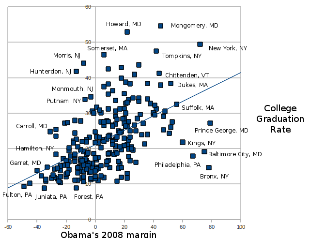
The 2008 election and college graduation rate: every county in the country.

I have done many plots in the past, showing the connection between Obama's margin in the 2008 election, and college graduation rates. After having done a number of these, I thought it would be worthwhile to go the whole distance, and get the data for every one of the United States' 3300+ counties, and see what it revealed.

As I wrote in the summer of 2008, the window of attack available on Obama during the campaign was narrow, and McCain's campaign chose not to portray Obama as a populist demagogue appealing to uneducated minorities. Instead, they did the more acceptable thing of painting Obama as a "celebrity" favorite of the Latte-sipping crowd. And even within the liberal camp, this was kind of accepted as truth: Obama was the favorite of the young, the college educated, and the urban, as well as of the poor and minorities.

But what does the data say? By looking at county-level data, we have a tremendous amount of datapoints to look at. This many data points deals with much (but not all) of the limitations of working with only two variables. One of the biggest problems with looking at college graduation numbers is that they often occur in urban areas that also have large numbers of poor, minority voters. Did New York County (also known as Manhattan) have a wide margin for Obama because it is one of the best-educated counties in the country, or because it is one of the most ethnically diverse? With enough datapoints, the answer emerges. (Although, of course, the answer is the somewhat predictable, and somewhat disappointing, "both"). Of course, looking at county level data has its own problems: my data includes Loving County, Texas, population 56, and Los Angeles County, California, population 10,000,000, and both are given equal weight. This is especially a problem because certain areas of the country, (mostly in the south and east), have lots and lots of little counties, whereas many of the Western states have much fewer counties. For that reason, I will be breaking these figures down into regions in upcoming posts.
Also, of course, the fact that as a counties college educated population goes up, that it becomes more politically liberal, doesn't "prove" that it is the college educated people that are becoming more liberal. However, with 3300+ data points, it certainly is a hard case to argue against.

With those caveats in mind:


The first thing this shows is what every student of American politics should know: there are few fast and easy rules of American politics. There are counties that Obama won that are above the national mean for college graduation (25%), counties below it, and the same is true for McCain.
However, Obama did seem to do better than McCain amongst the most elite-educated counties. Of the 11 counties where more than 50% of the people are college graduates, McCain won only one: Douglas County, Colorado, and that was a relatively narrow victory. Above the 40% line, and even the 30% line, the situation is a bit more murky, although Obama still seems to be ahead. This is especially interesting because college graduation rates often coincide with affluence, meaning that these counties should not be all that difficult for Republicans to win, based on economic self-interest. Also, the high-education counties that McCain did win by large margins tend to cluster in one region of the country: the south, with some in the midwest. (Which will be explained further when I break this down by region).

Of the low education counties that Obama won, the most extreme examples, located in the lower right, tend to be heavily minority. They include Hispanic areas (Starr and Zavela, in the Texas border region), Native American counties (Shannon and Buffalo, in South Dakota), and African-American counties: (The Bronx, Baltimore City). There actually are some low-education white areas that Obama won as well: Eliot County, Kentucky and Anaconda/Butte, Montana, for example. Also, large chunks of the upper midwest are not highly college-educated, are white and rural, but tended to go for Obama.

This diagram also reveals some of the political constraints that are put on Obama's policy decisions. Obama won through a coalition of some of the most educated, affluent people, and some of the least educated and least affluent people. Even if we are cynical enough to discard the idea of being President for all the people, Obama (and the Democratic Party), have to somehow manage to keep a coalition that includes Pitkin County, Colorado (one of the country's wealthiest counties) and Baltimore City happy. There are often large differences in economic interests, worldview, and values between the high and low-educated counties of the US.

The Republican party also has the same problem: it certainly wants to win back those affluent suburban counties, but it has to at the same time keep its base (that gigantic sea of data points below the 20% mark), which is largely white, rural and low-education, happy.

And this is one way that 2012 will be fought.

Monday, March 22, 2010

The master plan is done, but it will take some time to tease it all out:

I have actually been making a scatterplot every day, I just haven't been posting them here.

But finally I put them all together:
I will be explaining what this is about, and then breaking it down, in upcoming entries.

Wednesday, March 10, 2010

Education in the Midwest:

It took me a while to put this together, but I put together a plot of high school and college rates in the Midwest (Minnesota, Wisconsin, Iowa, Illinois, Indiana, Michigan & Ohio).

I figured that these states make a good cohort, since they have relatively small geographical counties, usually without significant geographical boundaries between them, and they have a wide mix of agriculture and industry. Of course, as with any grouping, they aren't a perfect fit, but I think they work well enough.

(The picture should probably be clicked on, its a big picture).
After doing all this work, there isn't a lot of new information in this picture. Unlike in the Western states, there are quite a few counties with less than 10% college graduates. I think this might be an artifact of the small geographic size of midwestern counties: Western counties, because of their large geographic size, pretty much have to have certain facilities (such as hospitals) in every county. Midwestern counties, since there are no geographic barriers, don't. That is one possible explanation, at least.
Other than that, there is not a lot of surprises: big metropolitan areas tend to hang to the left, and the top right has four elite counties, three of which are college counties, and the other of which is a wealthy suburb of Indianapolis.

Monday, March 1, 2010

Race and education in Alabama

One thing I have wondered about is the generally low levels of education, both high school and college, in Southern states. I also know that many Southern states have high African-American populations, and this is a group that often is (statistically speaking) weak in education.

I bet the reader doesn't have to think very far for the various uncomfortable conclusions that could possibly be derived from looking at this.

But actually, when you look at things closely, it is better. Especially in this case:

Alabama is a good test bed for this, because it has a large number of counties, and they vary from 1 to 70% African-American. And across these counties, as you can see, the education tends to be fairly uniform: and for that matter, uniformly bad. Jus' sayin'. There are counties in Alabama between 60 and 65% high school graduation rate that are almost totally white, as well as counties with those numbers that are majority black. The one thing that is absent is any counties in the upper right: there are no majority African American counties with high high school graduation rates. Although Montgomery and Jefferson do come close.

What is interesting about this is there could be an assumption that is actually backwards. The reason why African-Americans, in the US, have lower education rates might actually be an artifact of the fact that many of them live in the rural south, where EVERYONE has low education rates. At least in part.